Do you run a blog about Animal Jam? Do you want to, but don't really know how to start?
Yes, yes you do.
I've been blogging since the beginning of Summer 2012 and while I had a rough start, I got to know Blogger a little more along the way, to turn my blog from a default Watermark theme to where I am now.
Here are some useful and easy tips for customizing your blog in an Animal Jam-ish way and getting people to actually read it!
Part 1: Tips
1. The WATERMARK theme from blogger is easiest to customize if you want a really good AJ template.
2. Use complementary colors, but none that upset the eyes. Pastels and non-neon greens are good, but while complementary, red and green hurt the eyes!
Try to get that nature-y animal jam feel to your blog.
3. Post interesting content and keep your promises. Post frequently, is what I'm saying, but overall, quality trumps quantity!
4. White borders around images prevent you from posting transparent images, which are prettier to look at. If your blogger template (like watermark) has white borders around the images at default, get rid of them by copying this code into the CSS box:
.post-body img, .post-body .tr-caption-container, .Profile img, .Image img,
.BlogList .item-thumbnail img {
padding: none !important;
border: none !important;
background: none !important;
-moz-box-shadow: 0px 0px 0px transparent !important;
-webkit-box-shadow: 0px 0px 0px transparent !important;
box-shadow: 0px 0px 0px transparent !important;
}
Part 2: Template
Template customization is easy, but most of the things that are clear in the instructions can lead to the most basic looking blogs. The key to a steady stream of page views and comments is an aesthetically pleasing (nice to look at) blog, which means centered headers, nice fonts, pretty backgrounds, and gentle colors!
Downloading the Animal Jam font
Step 2. If it isn't already there, drag the downloaded file onto your desktop for easy access in a later step.
Step 3. (Note: I'm using a MAC right now. These steps may be slightly different for you if you don't.) Go to "Applications" and I suggest you have FontBook, unless it comes with the device which I'm really unsure of. Double click your font app.
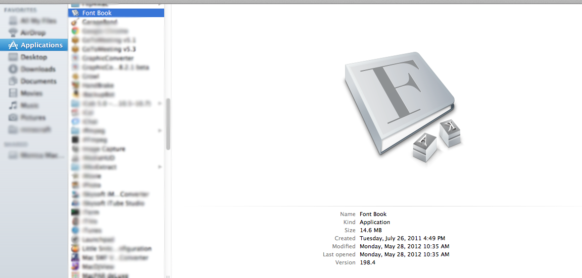 |
| Single click. |
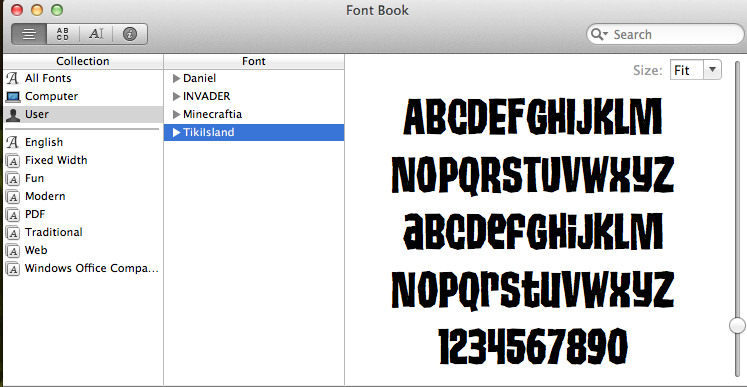 |
| Double click. |
Step 4. Drag the font file into your font collection and BAM! You got it.
Remember, the AJ font is called TIKIISLAND or TIKI ISLAND!
Creating a Header Image With the AJ Font
This is what I do to create a header image. It may be kind of unprofessional, but it's quick and yields better than mediocre results. For this, you need photoshop. I use Photoshop CS5.1 for this.
Step 1. Take a screenshot of a blank white space or a completely solid color. The size of the space determines the size of your image.
TIP: You can also download, say, an AJ downloadable from here. There are so many and some make very good banner templates!
Step 2. Open the image in photoshop and use the "TEXT" tool. Scroll down the font menu and select the font TIKI ISLAND or TIKIISLAND.
Step 3. Click where you want to type and type whatever you want.
TIP: Rotate the text easily by clicking EDIT and clicking FREE TRANSFORM.
Step 4. If your header is on a solid color background screenshot, go to
online-image-editor.com and make it transparent. It's kind of a low quality site, but with one click you can make a flawless (almost) transparent image.
TIP: Sometimes blogger or other image editing sites wont allow photoshopped images. Run them through a site that allows them, like the one linked above, and then put them on your blog.
Step 5. Go to LAYOUT on your blog's dashboard. At the top, click the HEADER widget and upload your image. Click the bubble next to INSTEAD OF TITLE AND DESCRIPTION. You're done!
Centering Your Header
Step 1. Go to your blog's dashboard and click on TEMPLATE
Step 2. A bit under the "Live on Blog" picture, click the CUSTOMIZE button.
Step 3. At the bottom of the menu below "Blogger Template Designer," click ADVANCED.
Step 4. Scroll down the "Advanced" menu and click the button that says ADD CSS.
Step 5. Copy and paste this code into the CSS box:
#header-inner img {margin: 0 auto !important;} #header-inner {text-align:center !important;}
Step 6. Save. You're done!
Getting a Good Background (TIP)
1. Find a nicely tiled background, like this or this. Basically, anything that either overlaps seamlessly into one another when tiled that can make it look like one big background. Totallylayouts has some pretty good ones. The Tumblr backgrounds are all meant to be tiled, so check those out in the link.
2. To have a full-screen background, the image needs to be pretty big, but not too big. It's kind of confusing, and since this post only consists of what I know, I suggest tiling your background or using one from the Backgrounds in the template designer.
Part 3: Getting Some Viewers
1. Add SEARCH DESCRIPTIONS to each of your posts. This will increase your viewers!
2. Sometimes other AJ blogs have "More Blogs" sections. Try to get into one of those!
3. Post ON TOPIC and relevant information that you know people want to read. They came to your AJ blog to read about AJ, not any other game. Think to yourself, what would you yourself want to read?
4. Create a Blog search description and include lots of keywords, but not too densely packed with them. You can easily create it from your blog's settings, no fancy coding needed!
5. Guest-post on popular blogs, and make them good posts. Let people get a good impression of you!
6. Variety is key. While daily item posts are interesting, mix it up a bit with some videos or drawings, and throw in some contests, too.
Jam on and good luck!


Thank chu!
ReplyDeleteThank you for all the help! Making a blog inspired by you, and thank you once again!!
ReplyDeleteOH YA IM DA THIRD COMMMMMENT
ReplyDelete